
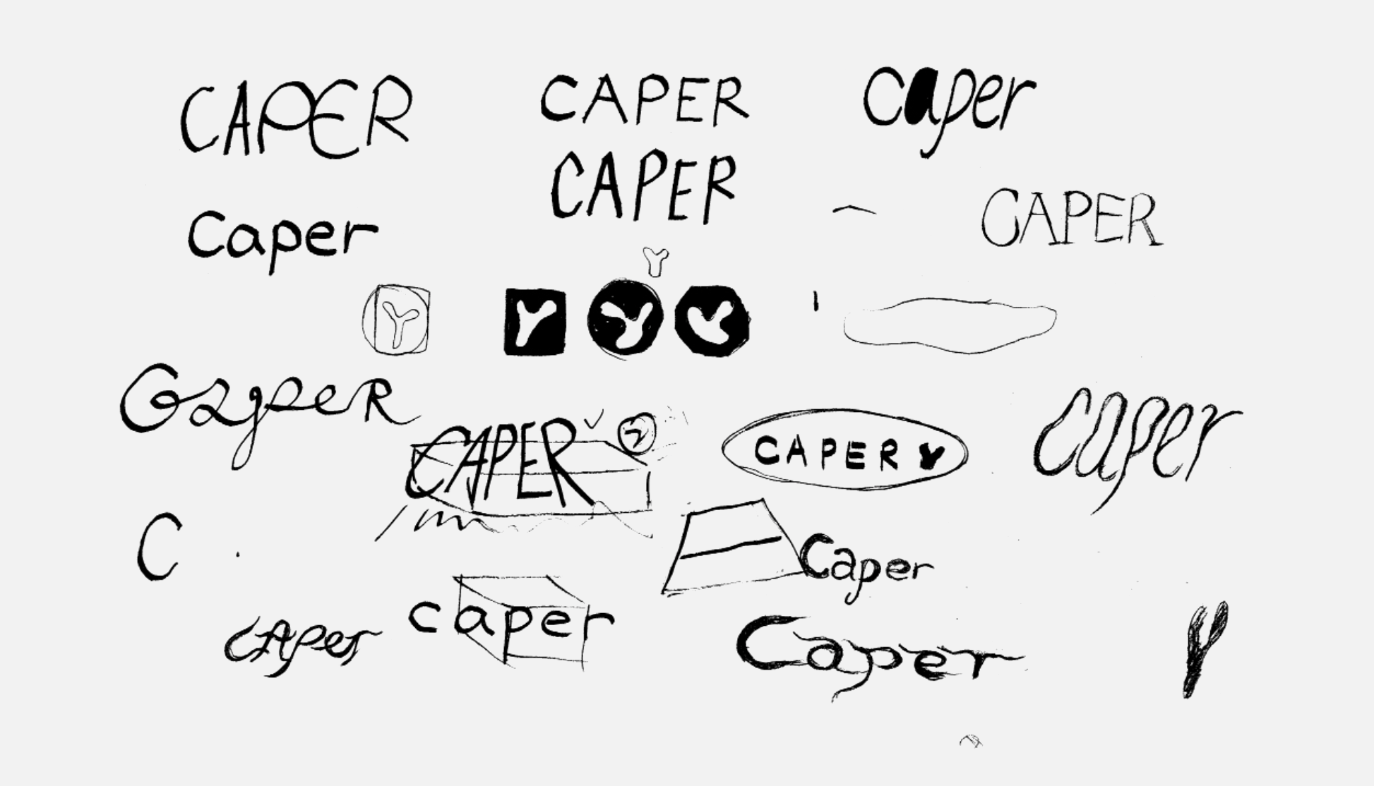
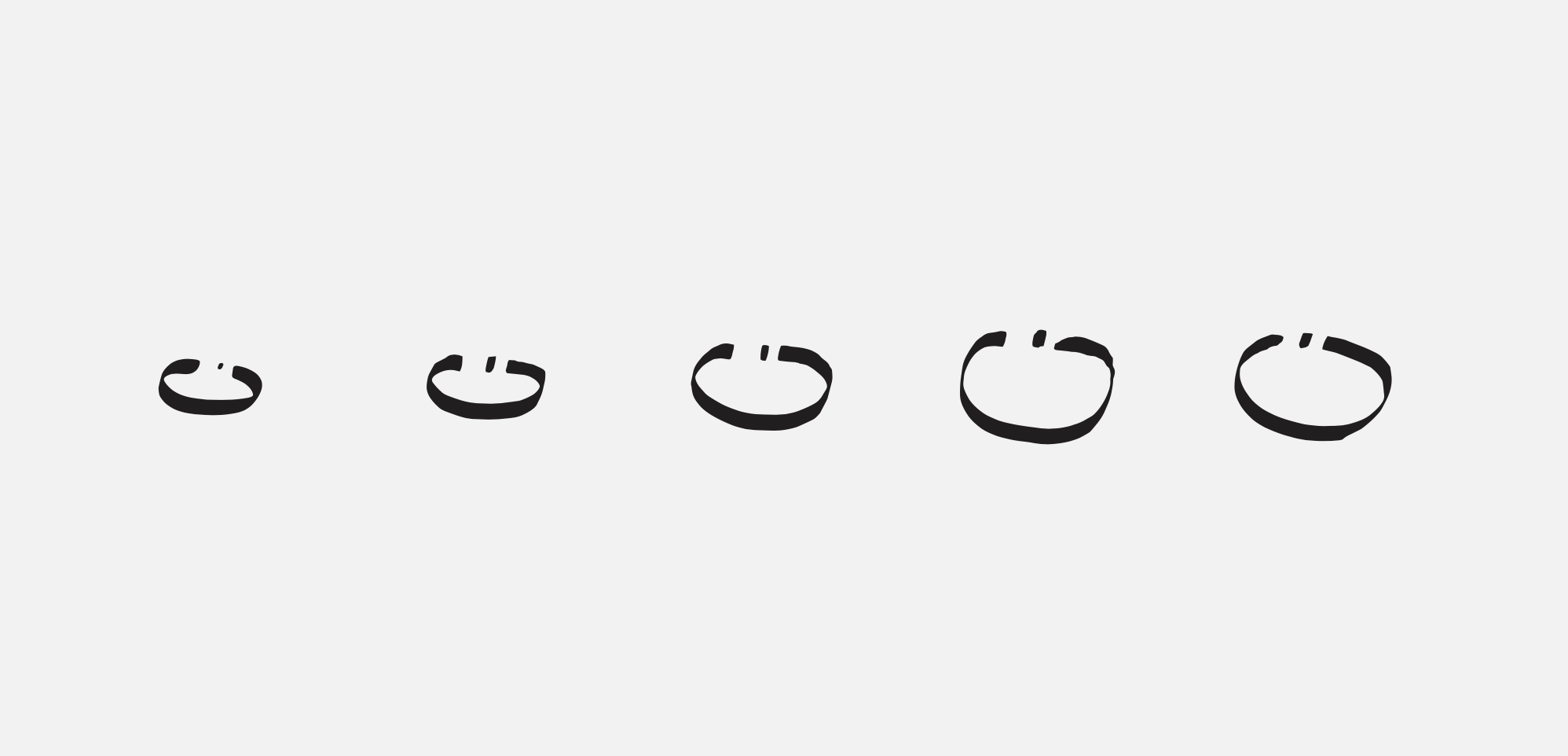
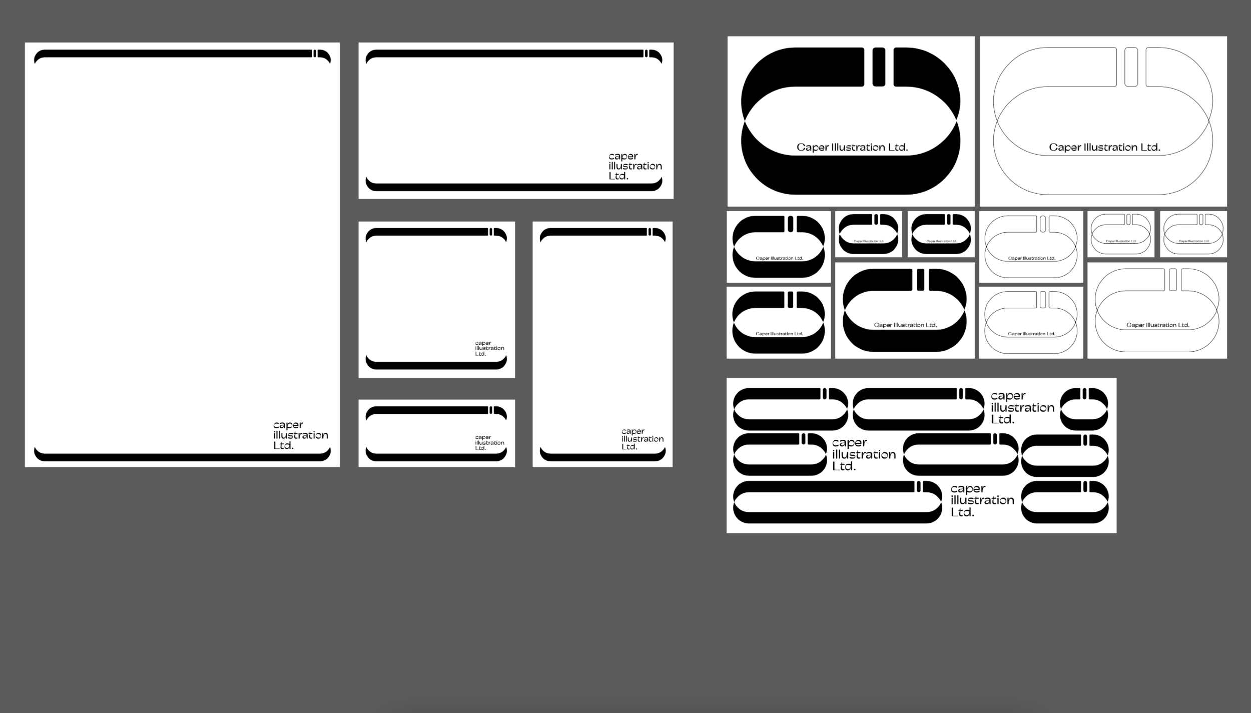
Caper's logo was born this way
1. Where are you based now and who do you work for?
I’m currently based in Shanghai, and recently I’ve been pretty occupied with developing new products for my own brand Rainreinreign.
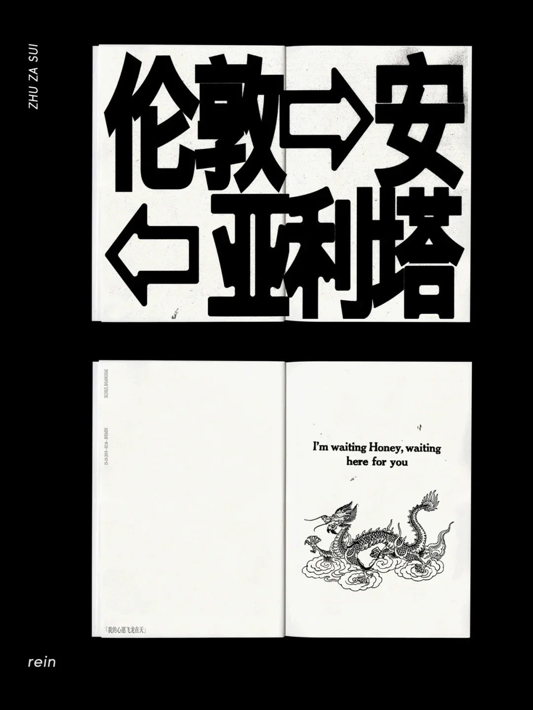
Rainreinreign ’s past graphic design works
2. How did you start to develop the idea of designing Caper's visual system? Can you share your inspiration board with us?
Before I started working on the design, I communicated with the co-founders team. They told me about the Caper’s brand story, and eventually narrowed it down to the three core concepts of “locality (illustrators of Asian descent)”, “pairing (between designers and clients)”, and “interactive development”. Based on the three key points, I started developing the visuals and reached the complete visual system at present.

Sketches
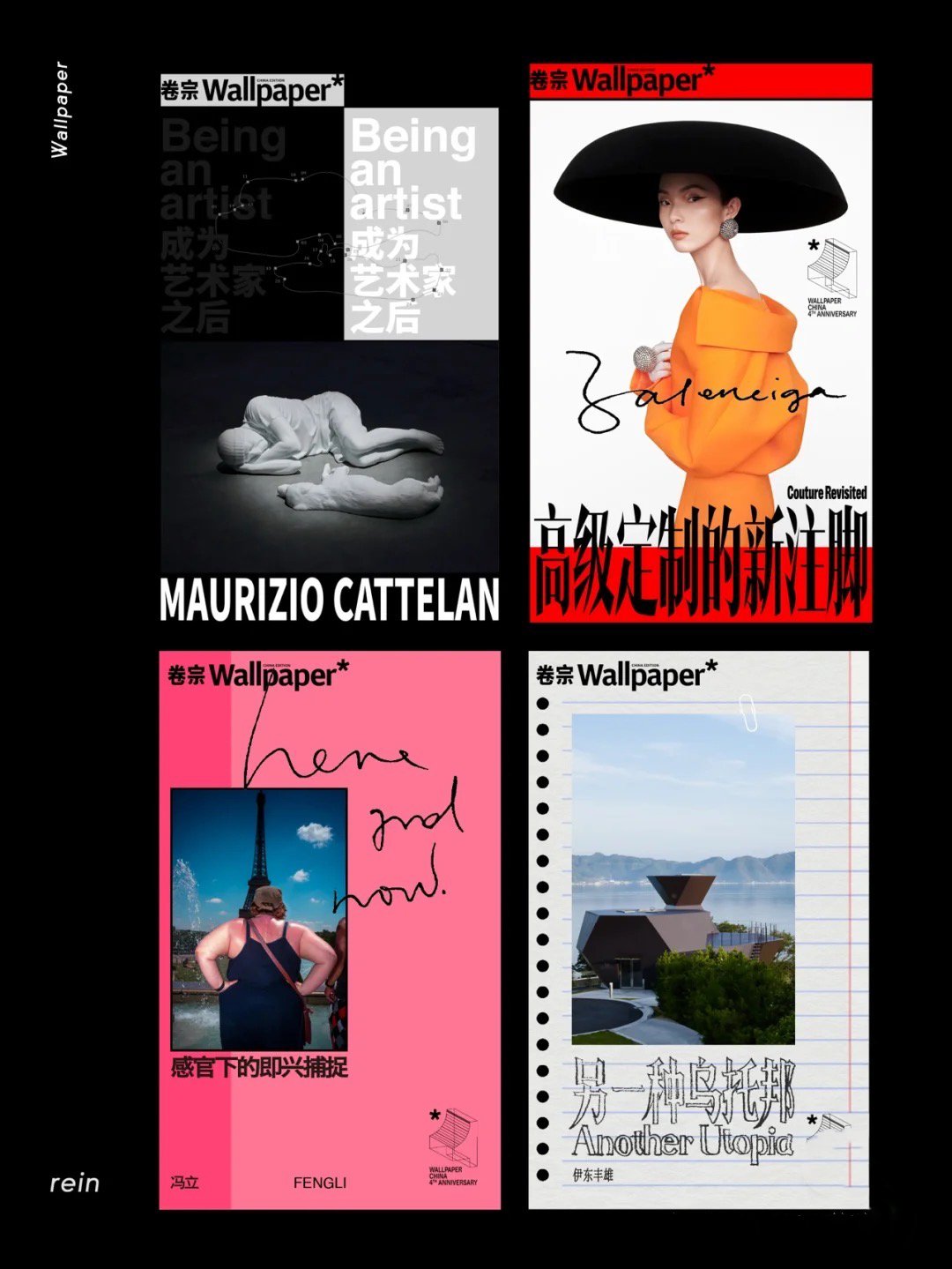
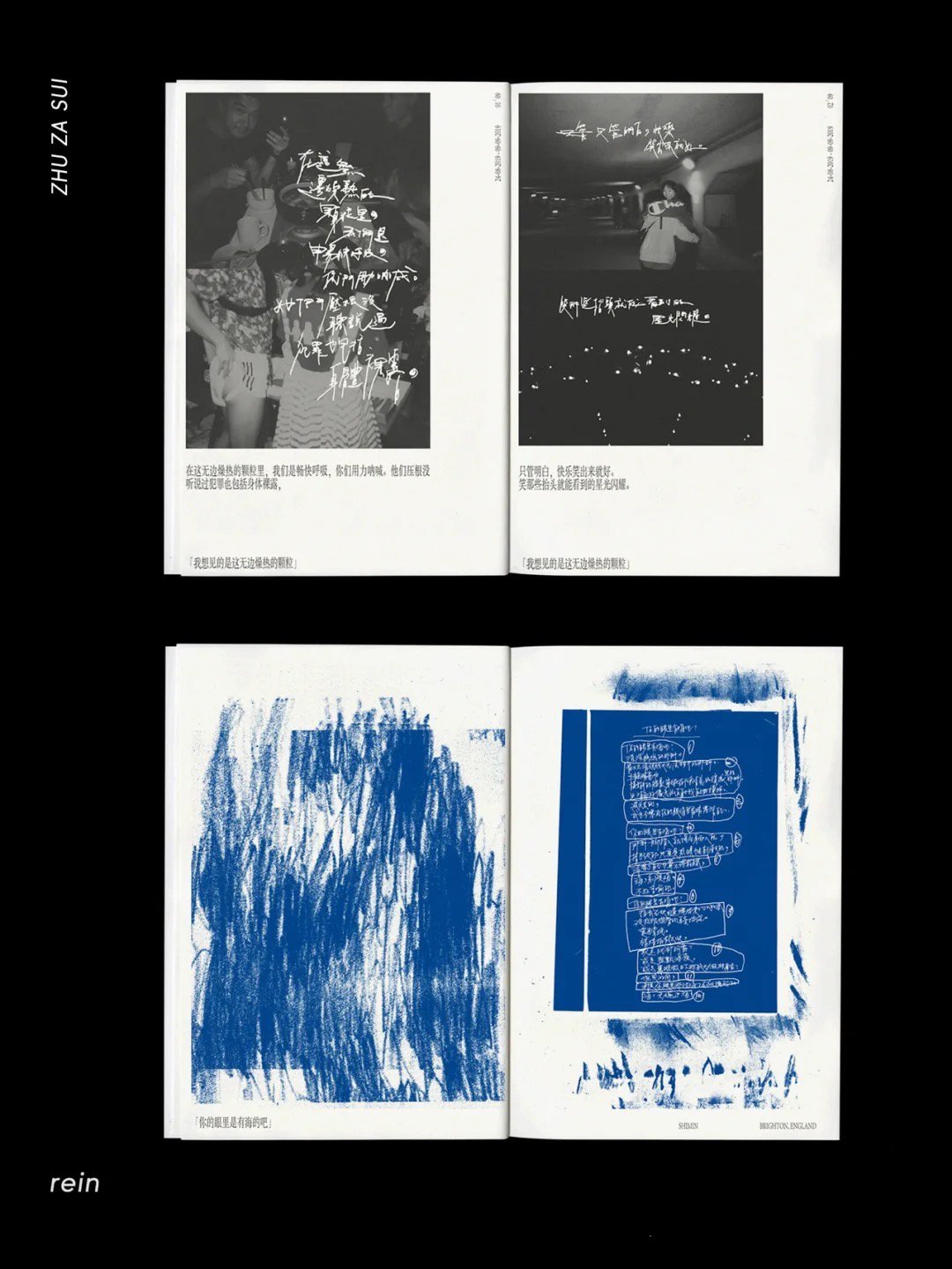
Rainreinreign ’s past graphic design works for Wallpaper
3. How would you describe your style?
A: My style is rooted in prioritizing the client's needs as the foundation, complemented by employing natural design techniques.
4. How did you start this project? What was your favorite part?
A: A: I usually begin by rapidly sketching out my ideas, and then I carefully select a few concepts with potential, typically no more than three, to further refine and expand upon. My favorite part of the project was seeing my ideas come to life and taking shape through the design process.
5. How did you design Caper's color identity system and why did you use a green and soft yellow color scheme?
A: Green is a dynamic and lively color that represents vitality and life, while yellow brings warmth and hope. I chose a green and soft yellow color scheme to convey these emotions and create a visual match that resonates with the audience, reflecting the spirit of Caper.
6. What's your secret to staying inspired and motivated?
A: A: To stay inspired and motivated, I expose myself to new experiences such as movies, music, books, and short excursions. I also maintain a critical mindset, constantly challenging myself to push the boundaries of my creativity.
7. Who is your dream client? Why?
A: A: Haha, my dream client would be Cai Mingliang. I admire his films for their portrayal of everyday life and emotions, and I resonate with his approach to storytelling.
8. What tools do you typically use, and how do they impact your work?
A: A: My typical tools include a computer, scanner, and paintbrushes. These tools enable me to quickly illustrate my ideas and bring my concepts to life, enhancing the visual impact and effectiveness of my work.
9. We love your animations and icons for Caper! Do you have any interesting stories to share behind them?
A: A: Thank you! Initially, I was uncertain about working on illustrations and icons, as it wasn't my forte, and I had minimal expectations. However, after completing the logo, I realized that the circular shape was distinctive, which inspired me to incorporate it into different scenes. As I documented the process, the motion design naturally evolved. This experience reinforced the importance of recording the creative process, as it can lead to unexpected and exciting results.


10. Do you use illustration when providing visual solutions for other clients? How do you see what Caper is doing?
A: A: Illustration is not my strong suit, so I don't use it extensively in my visual solutions for other clients. However, I believe that the right illustration can greatly enhance and support the overall layout design, creating a compelling visual impact. As for Caper, I see them as making a positive impact on the industry by facilitating collaboration between designers and clients and driving the industry towards improvement.
11. How would you comment on your past works and what kind of works are perfect in your opinion?
A: A: For my past works, I find the most satisfaction in projects that effectively express the core values of my clients' brands while showcasing my personal style. To me, a perfect assignment is one that achieves a harmonious balance between meeting the client's objectives and allowing for creative expression.
12. Please recommend a movie you like and the top three soundtracks you listen to when working.
Movie: High School Art Class - Pretty Lights
Soundtrack: Spilling Over Every Side - The Fall by Hans Zimmer from Dune
Soundtrack: Nimetön - Erkki Kurenniemi from Äänityksiä: Recordings 1963-1973 (Stray Dogs by Cai Mingliang)
The soundtracks I listen to while working can vary greatly, ranging from calming and tranquil tunes to loud and energetic tracks, depending on the type of work I am doing at the moment.